Web Development · Non-profit · Next.js
A website for a foundation that hasn't launched its programmes yet: calm, credible and honest about where it is.
The Bene Est Akrofi Foundation is a Ghanaian non-profit based in Apirede Akuapem, in the Eastern Region. It exists to serve underprivileged, vulnerable and marginalised communities across Ghana, and it is in its founding phase: the constitution is written and the leadership is in place, but the programmes are still being resourced.
I designed and built beneest.org as its first public face, on top of the brand identity I created for the foundation.
A foundation earns trust before it has results to show. The site had to do three things at once.
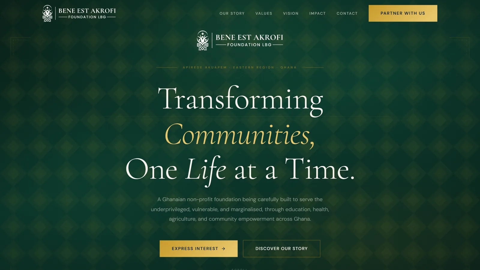
Look established without overpromising. No stock photos of smiling beneficiaries and no impact numbers that don't exist yet. The site says plainly that this is the founding phase and that programmes will be announced when the foundation is ready to deliver on them.
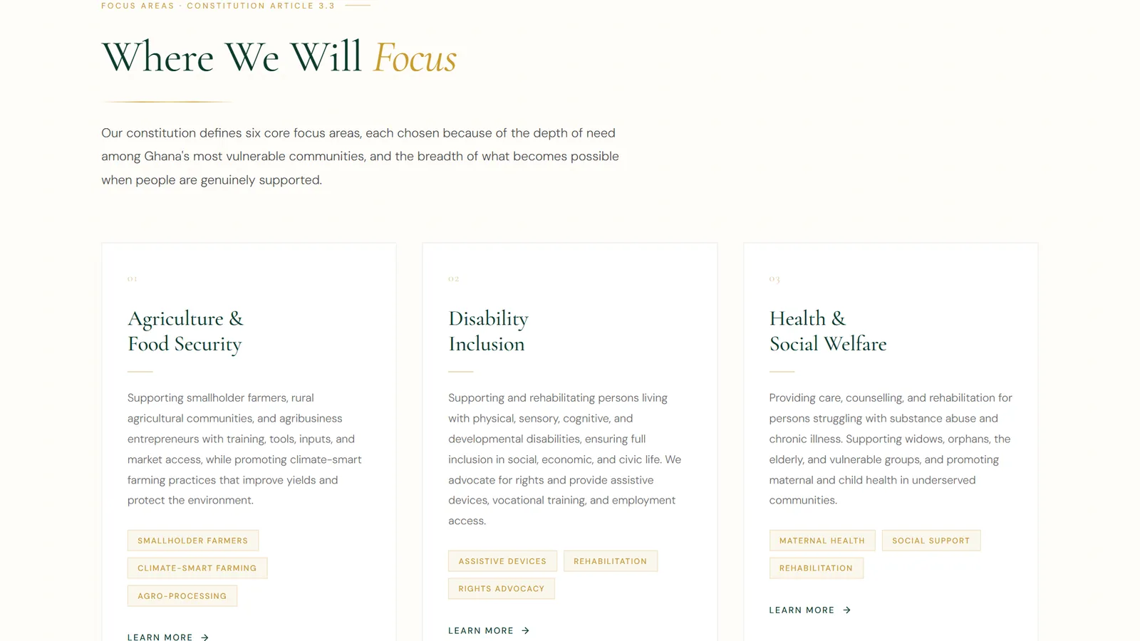
Explain a wide mission clearly. The constitution defines six focus areas, from agriculture to disability inclusion to the environment. Visitors needed to grasp the whole scope quickly, then go deeper only where they care.
Give partners a way in. Donors, volunteers and institutions need to find the right contact and express interest now, ahead of the official launch.
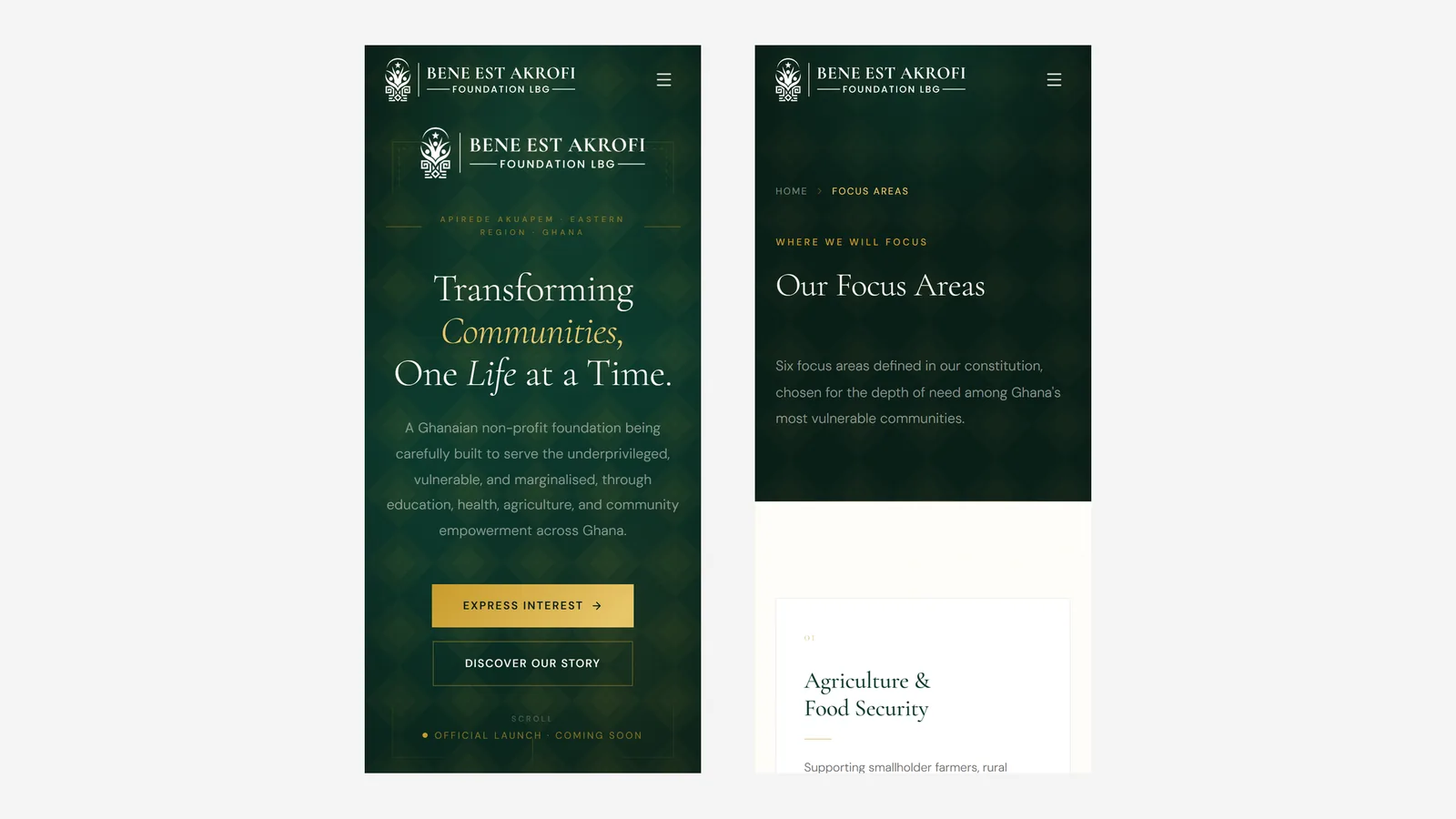
The look comes straight from the identity: deep forest green and gold on a warm ivory ground, set in Cormorant Garamond for headlines and DM Sans for reading. Key words in each headline are set in gold italics (Communities, Life, Values, Focus), so the page has a voice without needing louder graphics.
A subtle diamond pattern sits behind the dark sections, and thin gold dividers and numbered sections give the long page an editorial rhythm. Dark green sections alternate with light ivory ones, so each part of the story gets its own room.
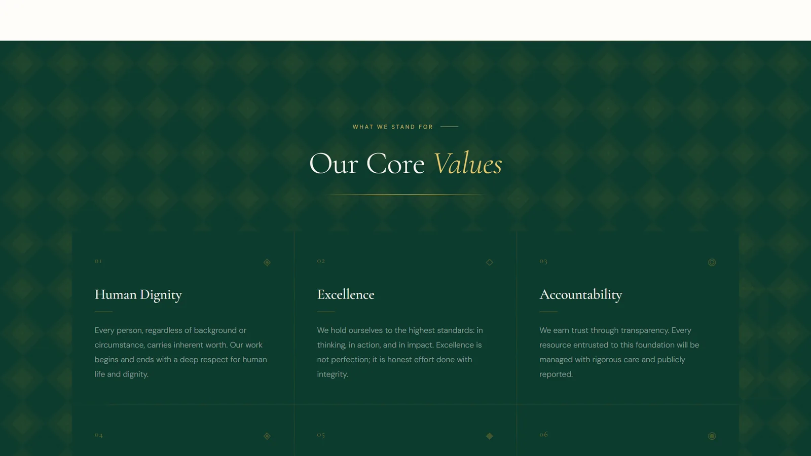
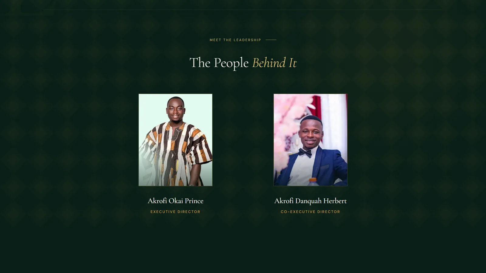
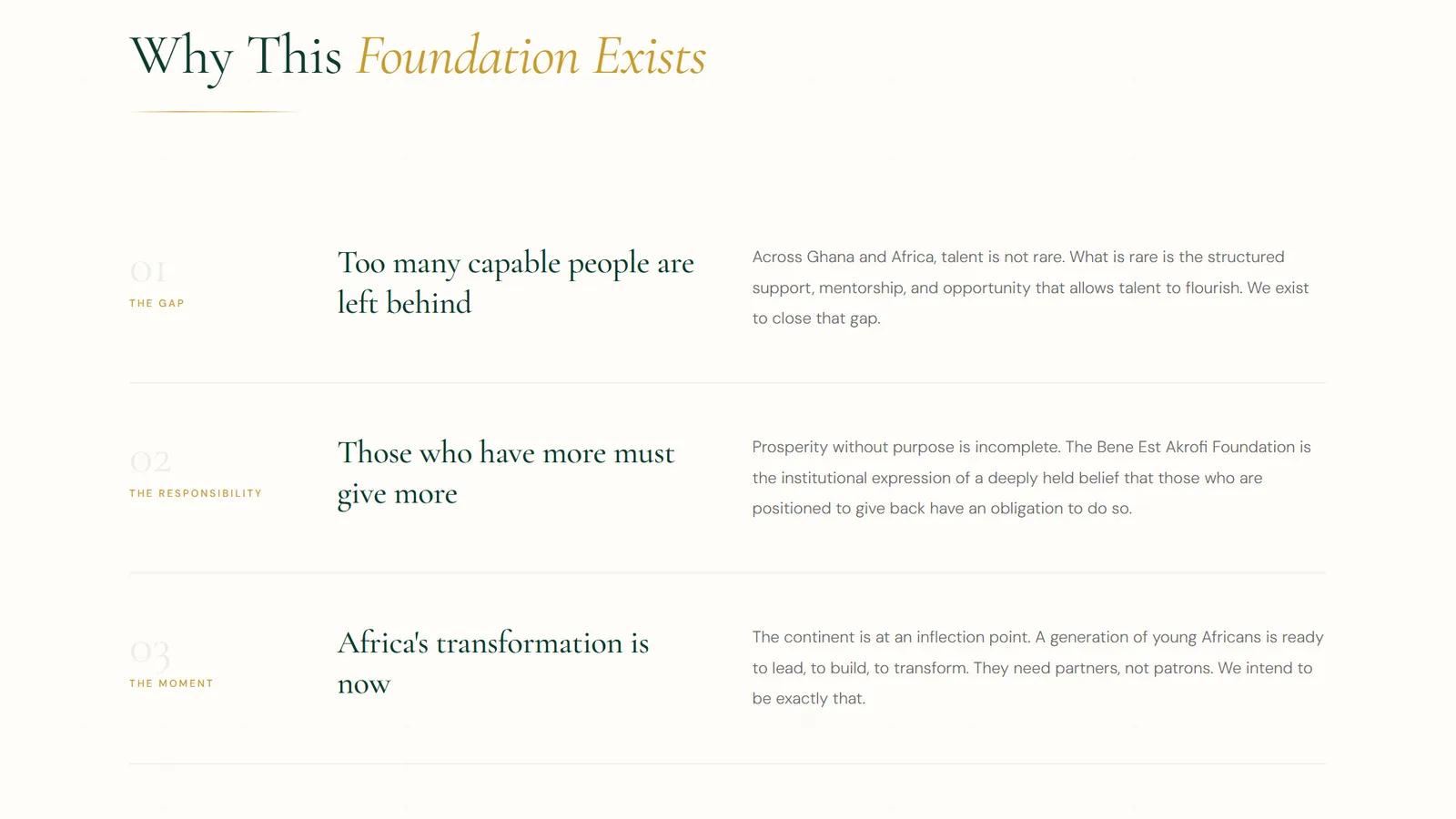
The homepage is one continuous story: introduction, core values, vision, focus areas, leadership, why the foundation exists, transparency, and finally a way to get in touch. Each section links out to a deeper page for visitors who want the detail.
Behind it sit the pages a serious institution is expected to have: our story, mission and vision, core values, leadership and governance, a hub and a detail page for each focus area, ways to get involved (partner, volunteer, donate, careers), a transparency page, contact, and the privacy policy and terms of use.
The six focus-area pages are generated from a single data file, with one route rendering every area. Adding or editing a focus area is a content change, not a design task.
Pre-launch status is shown, not hidden: “Official launch · Coming soon” sits in the hero, the headline for the founding section reads “Something important is being built”, and the focus areas are framed as where the foundation will focus.
The transparency section carries the foundation's commitments in the open: annual public financial reporting, independent audits, open governance documentation and stakeholder engagement. It also carries the foundation's registration details. For an organisation that has no track record yet, being checkable is the strongest credibility signal available.
The copy leans on the constitution's own language, so the site and the founding documents say the same thing.
Next.js, React and TypeScript with the App Router, built to load fast on mobile networks. Tailwind CSS carries the design tokens (the greens, golds and ivories are defined once as theme colours), and Framer Motion handles scroll-in reveals through one shared animated-section component, so motion stays consistent and restrained.
Layout, header, footer and page-hero pieces are shared components, and section content lives in focused components: introduction, values, vision, focus areas, leadership, governance and so on. A new page is mostly assembly, which matters for a foundation whose programmes will keep growing.
Images go through the framework's optimiser and are served at several sizes, and the site is responsive down to phones, with a menu button replacing the header links on small screens.
The primary call to action, “Partner with us”, is always one click away in the header, and the homepage ends with an “Express partnership interest” form for name, email, organisation, the kind of enquiry and a message. Separate addresses for general enquiries, partnerships and donations are listed on the contact page, so messages reach the right person from day one.
The foundation has a website that matches its offline identity and says exactly what it can stand behind: who it is, where it works, what it intends to do and how it will be held accountable. The site is live, and when the official launch comes, new programmes slot into a structure that is already there.
Together with the brand identity, this completes the foundation's visual and digital presence, from the same designer with the same understanding of the organisation.