Logo Design · Branding · Non-profit · Identity
Logo design and brand identity for a foundation built on purpose — a visual language that communicates credibility, trust, and the weight of the work it represents.
Foundations carry the burden of institutional trust in a way commercial brands don't. Donors, partners and beneficiaries all need to believe in the organisation before they engage with it. The identity has to do that work quietly: not through decoration, but through design decisions that signal permanence, care and accountability.
The brief was to create a logo and identity system for the Bene Est Akrofi Foundation that would represent a Ghanaian non-profit with appropriate weight, across official documents, stationery, signage and digital presence.
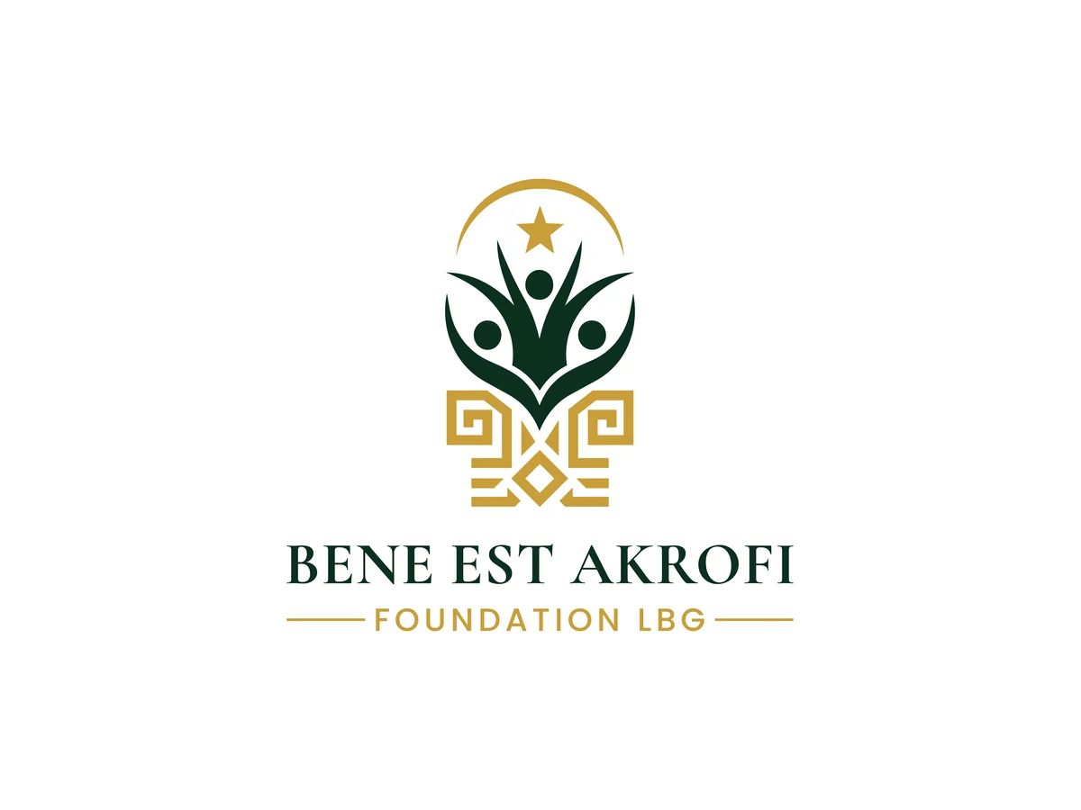
The symbol is built from three parts that read at a glance. People form a sprout, a group of figures whose arms rise together into leaves: the foundation's work is communities growing, not charity handed down. Above them, a star inside an arc holds the idea of purpose and a horizon worth reaching. Below, a geometric, interlocking base grounds the mark, a pattern that gives it weight and a rooted, African sense of place without leaning on cliché.
Institutional marks don't chase trends. This one is drawn with solid, confident shapes and no fine detail, so it looks as valid in ten years as it does today, and holds up from a letterhead header to a building sign.
The palette is two voices: forest green for authority and steadiness, and gold for warmth and worth, with a few gold tones that allow depth without adding another hue. It is serious without being corporate, and it reads clearly on white, on cream paper and on black.
The wordmark is set in a classical serif in capitals, BENE EST AKROFI, with FOUNDATION LBG in spaced sans-serif between two fine rules. The pairing keeps the name formal and the legal form legible. A short line, Empower · Educate · Transform · Legacy, sits under the name in the full lockup.
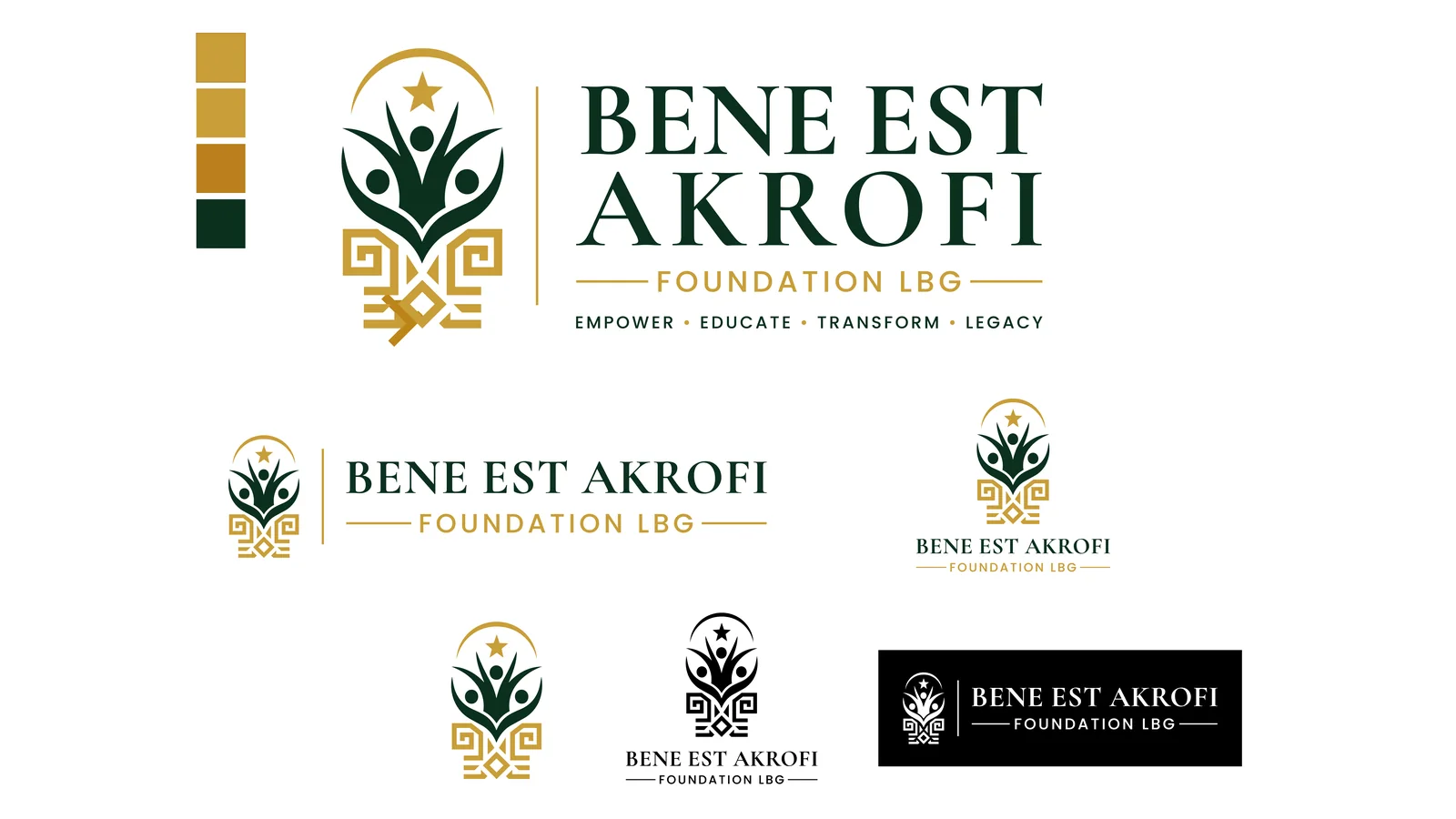
One logo never fits everywhere, so the identity is delivered as a family. The main and vertical logos carry the full lockup with the tagline. A horizontal version suits headers and the web. A vertical type version works as a plain wordmark. An icon and a simple icon serve small spaces like favicons and profile pictures.
For every version there is a one-colour monogram that works in black, and an inverted version in white for dark backgrounds, so the mark is never forced onto a surface it wasn't drawn for.
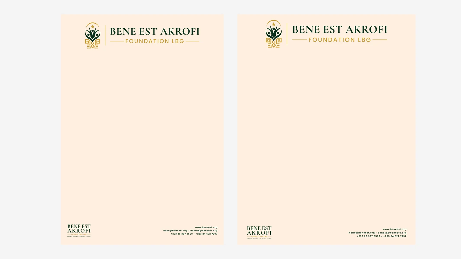
Official letters are where a foundation's credibility is tested. The letterhead puts the horizontal logo at the top, keeps the page clear for writing, and carries the website, email addresses and phone numbers quietly in the footer. It is shown here on cream paper in A4 and US Letter sizes, and the templates cover both plain and coloured paper.
I also built the letterhead as Word templates, so the team can write correspondence in Word, with the identity already in place and no one needing to place a logo by hand.
The Bene Est Akrofi Foundation now has an identity that matches the seriousness of its work. The logo communicates purpose and credibility from first sight, the family of versions covers print, web and dark backgrounds, and the stationery lets the foundation write official letters on-brand from day one.
The same identity carries into its website, where the green and gold, the serif and the mark all appear unchanged.